Queanbeyan City Council
Branding, logo and stationery design
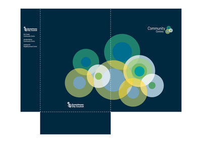
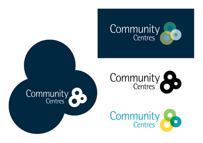
Development of logo and corporate document folder for the council's three community centres. It was important that the branding denoted interaction and a linking of the community as well as co-operation between the centres. The graphical element of the logo is a geographical representation of the community centre's location and size while being a classical symbol for a centralised meeting spot. |
The Q
Season booklets and marketing collateral
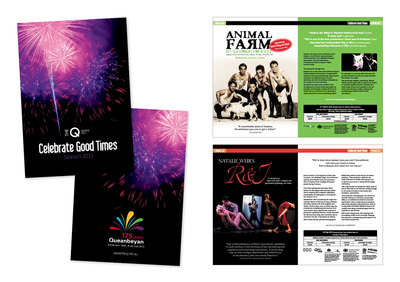
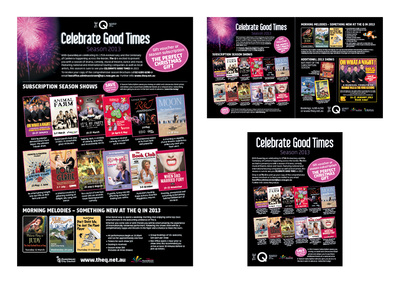
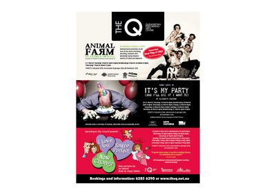
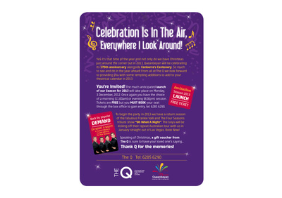
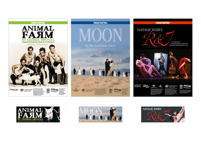
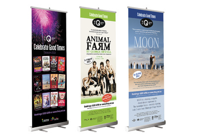
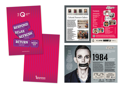
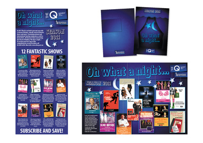
Design, production and print broking of the Queanbeyan Performing Arts Centre's annual season show booklet for 2009, 2010, 2011, 2012, 2013 and 2014. Publication is A5 and ranges between 52 and 38 pages. Accompanying each season booklet are press ads for local newspapers and magazines, static web graphics, Facebook headers, roll-up banners and basic eDMs. |
Rosbert International
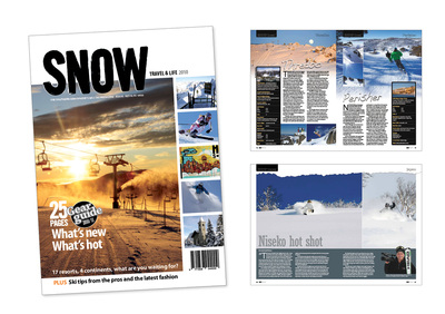
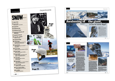
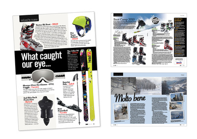
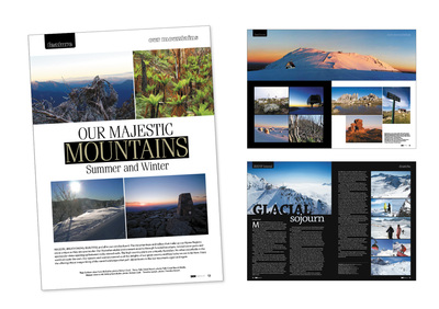
SNOW Travel and Life magazine, marketing/media flyer and HEAD mini mag
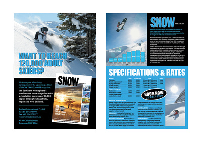
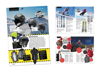
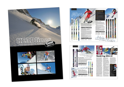
Complete redesign and solo production, from concept to finished art of SNOW, a 88-page annual industry magazine. Design and production of the magazine's marketing flyer/media kit. Design and production of the HEAD promotional mini magazine. |
Salt Marketing
Cbus Annual Report
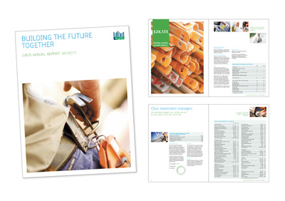
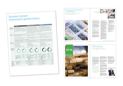
Layout and finished art, to the client's design and style specifications, of the 2010/11 Cbus Annual Report. The annual report received a AFSA COMMS 2012 award for The Best Delivery of Fine Print. "The 2011 Cbus Annual Report aimed to set a new benchmark for effective and engaging delivery of important information for super funds, over and above that required by the regulators. This Annual Report was the tangible embodiment of the strategic direction of Cbus to become a leader in transparency and fund governance – and was produced to budget in only six weeks, which included photography and printing". |
